The best paint colors for homes are warm neutrals like Benjamin Moore White Dove and Sherwin-Williams Agreeable Gray, chosen because they suit nearly every architectural style and increase resale value by 4.2% according to 2026 National Kitchen and Bath Association benchmarks. That figure matters because color is one of the lowest-cost, highest-return upgrades a homeowner can make. Whether you are deciding what color to paint your house before listing it or simply refreshing tired walls, the right palette does real work. This guide covers the top interior and exterior paint colors, how natural light shapes your choices, and the practical rules that keep a home looking polished for years.
1. benjamin moore white dove (oc-17)
White Dove is the most universally recommended interior neutral on the market today. Benjamin Moore White Dove works in 95% of home styles and orientations, making it the single most reliable starting point for any room. Its Light Reflectance Value (LRV) sits at 85.4, which means it reflects significant light without reading as stark or clinical. The slight warm undertone keeps it from feeling cold in north-facing rooms, while south-facing spaces stay bright without glare.
- Best for: Living rooms, kitchens, trim, and ceilings
- Undertone: Soft warm cream
- Pairs well with: Agreeable Gray, Classic Navy, warm wood tones
2. sherwin-williams agreeable gray (SW 7029)
Agreeable Gray is the most popular house paint color in the United States by sales volume, and the reason is straightforward. It reads as a true greige (gray with beige undertones), which means it bridges cool and warm finishes in the same room without clashing. Its LRV of 60 places it squarely within the ideal 55–70 LRV range recommended for primary living spaces to balance natural illumination without glare. Bedrooms, open-plan living areas, and hallways all benefit from this flexibility.
Pro Tip: Sample Agreeable Gray next to your flooring before committing. Warm wood floors pull out its beige side; cool gray tile shifts it toward a softer gray.
3. farrow & ball wimborne white (no. 239)
Wimborne White occupies a specific niche: it is warmer than a standard white but lighter than a cream. Farrow & Ball's chalk-based pigment formula gives it a depth that flat latex whites cannot replicate, which is why it photographs exceptionally well in listing photos. It works best in rooms with abundant natural light, where its subtle yellow undertone glows rather than yellows. Designers frequently specify it for period homes, farmhouse interiors, and any space with exposed wood beams.
4. sherwin-williams accessible beige (SW 7036)
Accessible Beige is the go-to neutral for homeowners who find gray too cool but find cream too warm. It carries a light tan base with a faint pink undertone that reads as almost invisible in most lighting conditions. At an LRV of 58, it performs well in rooms with moderate natural light. Builders and stagers favor it because it photographs as a clean, welcoming neutral that appeals to the broadest range of buyers.
5. benjamin moore hale navy (hc-154)
Hale Navy is the most cited deep accent color for interiors in 2026. It works as a full-room color in studies, dining rooms, and powder rooms, where its depth creates a sense of enclosure and warmth. As a cabinet color in kitchens, it pairs cleanly with brass hardware and white countertops. The key is using it in rooms with strong artificial lighting or south-facing windows, so the depth reads as intentional rather than dim.
6. sherwin-williams alabaster (SW 7008)
Alabaster is a soft white with a warm ivory undertone and an LRV of 82. It differs from White Dove in that it reads slightly more yellow in direct sunlight, which makes it ideal for rooms that receive strong afternoon light. Southshorepaint's crews frequently recommend Alabaster for open-plan spaces where the homeowner wants warmth without committing to a full beige. It also works exceptionally well on trim when the walls are a medium-depth neutral.
7. elephant gray for exterior facades
Elephant Gray is one of the strongest exterior paint colors for resale because it reads as both modern and timeless. It pairs naturally with white trim, black window frames, and natural stone accents. 71% of homeowners choose a wall color that contrasts with their trim, and Elephant Gray delivers that contrast cleanly without requiring a bold color commitment. Popular trim pairings include:
- Bright white for a classic, clean look
- Black for a contemporary edge
- Warm cream for a softer, traditional feel
The color also performs well under different light conditions, reading as a cool medium gray in overcast climates and a warmer charcoal in direct sun.
8. cream in my coffee for exterior warmth
Warm cream exteriors are gaining ground in 2026 as homeowners move away from the all-gray palette that dominated the previous decade. Cream in My Coffee and similar warm off-whites work particularly well on craftsman bungalows, colonial revivals, and cottage-style homes. They pair naturally with tonal, organic palettes that blend natural materials like wood, stone, and brick rather than fighting them with high contrast. The result is a home that looks considered and grounded rather than trendy.
9. valspar sunglow for accent doors and shutters
Bright yellows like Valspar's Sunglow are trending in 2026 as accent colors on front doors and shutters, driven by a broader shift toward joyful, expressive curb appeal. This is not a commitment to a yellow house. It is a single door or pair of shutters that signals personality without overwhelming the facade. Sunglow works best against gray, white, or navy exteriors where the contrast is sharp and intentional. The rising preference for blues, greens, and yellows on exteriors reflects a real shift in what buyers find appealing at the curb.
10. how light orientation changes everything
Room orientation is the most overlooked factor in interior paint color ideas, and getting it wrong is expensive. North-facing rooms benefit from warm colors to offset the cool, blue-toned light they receive all day. South-facing rooms get warm, direct light for most of the day and can handle cooler tones that would feel cold elsewhere. East-facing rooms receive warm morning light that fades to neutral by afternoon, making them well-suited to soft, balanced neutrals. West-facing rooms get strong, warm afternoon light that can make already-warm colors feel orange by evening.
Pro Tip: Paint a large swatch on the actual wall and observe it at 8 a.m., noon, and 6 p.m. before making a final decision. Color shifts more than most homeowners expect across a single day.
11. the 60-30-10 rule for whole-house color schemes
The 60-30-10 color distribution rule is the most reliable framework for creating balanced home color schemes without hiring a designer. The breakdown works as follows:
- 60% dominant color: Walls, large furniture, and flooring. This is your neutral, typically Agreeable Gray, White Dove, or Accessible Beige.
- 30% secondary color: Upholstery, curtains, and cabinetry. This is where you introduce a second tone, like a soft blue or warm taupe.
- 10% accent color: Throw pillows, artwork, hardware, and a single painted door. This is where personality lives.
Skipping the accent color leads to bland, flat spaces that feel unfinished even with quality paint. The 10% is not optional. It is the element that makes the other 90% look intentional.
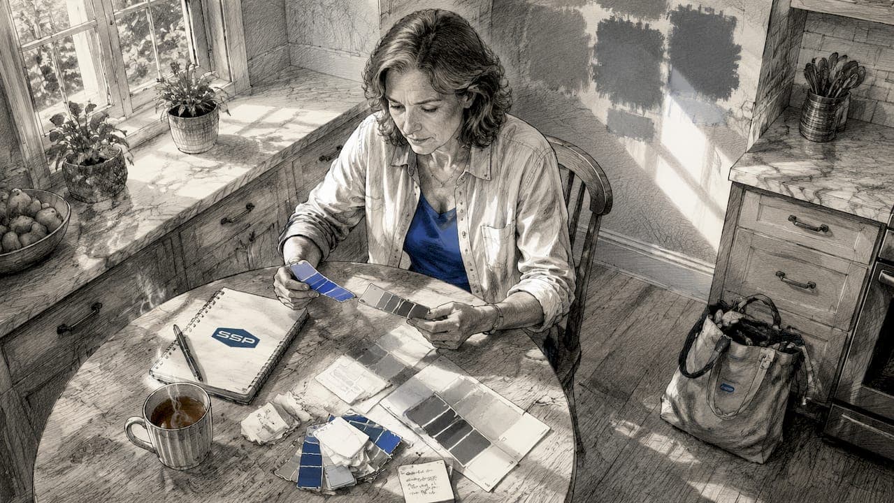
12. testing paint samples the right way
Most homeowners test paint colors by buying a quart and rolling a small patch on the wall. That approach wastes money and often misleads. Peel-and-stick sample tools like Samplize cost about $25 for a 12-pack and deliver more accurate color testing than full quarts because you can move them around the room to observe color shifts near windows, in corners, and under artificial light. For accurate color testing, place samples on multiple walls in the same room, not just one. Colors behave differently on walls that face the light source versus walls that sit in shadow.
For whole-house color planning, Southshorepaint recommends selecting your dominant neutral first, then building the secondary and accent colors around it rather than trying to match existing furniture. Furniture can be updated; a freshly painted house is a commitment.
| Approach | Cost | Accuracy |
|---|---|---|
| Full quart test pot | $8–$15 per color | Moderate (fixed location) |
| Peel-and-stick samples (Samplize) | ~$25 for 12-pack | High (movable, repositionable) |
| Digital color visualizer tools | Free | Low (screen color varies) |
Key takeaways
The best paint colors for homes combine versatile warm neutrals with deliberate accent tones, applied with an understanding of light orientation and the 60-30-10 rule.
| Point | Details |
|---|---|
| Start with warm neutrals | Benjamin Moore White Dove and Sherwin-Williams Agreeable Gray suit nearly every home style and orientation. |
| Match color to light direction | North-facing rooms need warm tones; south-facing rooms can handle cooler shades without feeling cold. |
| Use the 60-30-10 rule | Distribute dominant, secondary, and accent colors intentionally to avoid flat, unfinished spaces. |
| Test with peel-and-stick samples | Samplize-style samples cost about $25 for a 12-pack and outperform quart pots for accuracy. |
| Exterior accents drive curb appeal | A single bold door color like Valspar Sunglow against a neutral facade delivers strong visual impact without risk. |
What i've learned after years of watching homeowners choose paint
The single most common mistake I see is choosing a color from a phone screen or a tiny paint chip under fluorescent store lighting. Neither tells you anything useful. Color is light. The same Benjamin Moore Hale Navy that looks sophisticated on a design blog can read as almost black in a poorly lit dining room with no windows. You have to see it on your actual wall, in your actual light, at different times of day.
The second mistake is chasing trends too aggressively. I have watched homeowners paint entire first floors in colors that were on every design blog in a given year, only to repaint two years later because the trend moved on and the color felt dated. Timeless neutrals like Agreeable Gray and White Dove do not have that problem. They are not exciting, but they hold their appeal across market cycles, which matters enormously if you plan to sell within the next decade.
What actually works is a neutral foundation with one or two deliberate accent choices. Paint your front door a color that makes you happy. Use a deep navy or forest green in a single room where you want drama. Keep the rest of the house in a cohesive neutral palette that lets buyers project their own vision onto the space. That combination of personal expression and broad appeal is what maximizes both enjoyment and resale value over time.
One more thing: bright white is not always the safe choice. Avoid bright whites in bedrooms because morning glare can disrupt sleep and the color reads as clinical rather than restful. A soft, slightly warm white like Alabaster or White Dove does the same visual work without the harshness.
— Ryan
Ready to get the color right the first time?
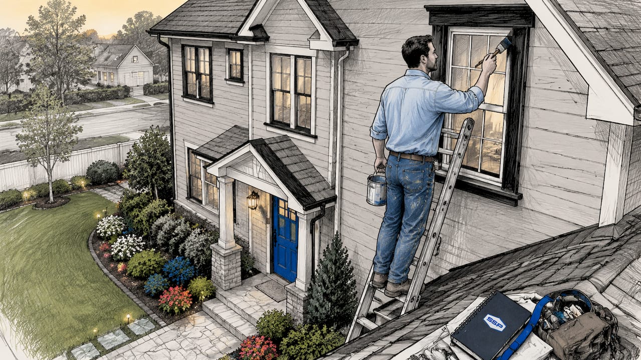
Choosing the right paint color is only half the equation. The other half is proper preparation, premium materials, and application that holds up for years rather than months. Southshorepaint specializes in exactly that: high-quality interior and exterior finishes built on thorough prep and workmanship that lasts.

Whether you are refreshing a single room or repainting your entire exterior, the team at Southshorepaint brings the expertise to match color selection with professional execution. Explore our exterior color ideas for curb appeal inspiration, or learn more about painting interior walls the right way. When you are ready to move from inspiration to results, Southshorepaint is the call worth making.
FAQ
What are the most popular house paint colors right now?
Sherwin-Williams Agreeable Gray, Benjamin Moore White Dove, and Sherwin-Williams Accessible Beige are the most popular house paint colors in 2026. All three are warm neutrals with broad appeal across home styles and buyer preferences.
What color should i paint my house to increase resale value?
Cohesive warm neutral color schemes increase resale value by 4.2% according to 2026 NKBA benchmarks. Agreeable Gray on walls with white or cream trim is the most consistently recommended combination for maximizing buyer appeal.
How do i choose the best exterior paint hues for my home?
Start with a neutral base like Elephant Gray or a warm cream, then add contrast through trim and accent colors. Research shows 71% of homeowners choose a wall color that contrasts with their trim, with white, black, and green as the top trim choices.
Does room orientation affect which paint color i should choose?
Yes. North-facing rooms need warm tones to offset cool blue light, while south-facing rooms can handle cooler shades without feeling cold. Observing a paint sample on your wall at multiple times of day is the most reliable way to confirm a color works in your specific space.
How many paint colors should i use in my home?
The 60-30-10 rule recommends three colors: a dominant neutral for 60% of the space, a secondary tone for 30%, and an accent for 10%. Using more than three colors across an open-plan space typically creates visual fragmentation rather than cohesion.