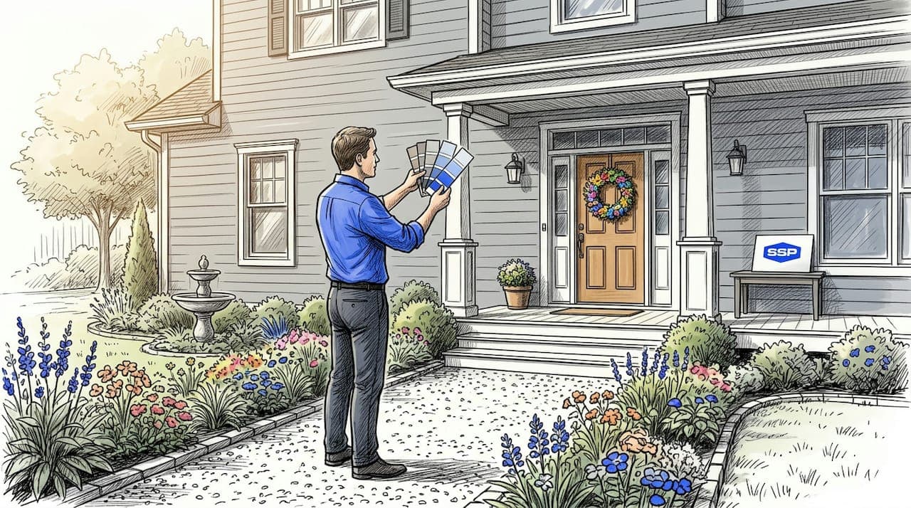
Choosing the right exterior paint color ideas for your home is one of the most high-stakes aesthetic decisions you can make as a homeowner. Get it right and your house looks polished, intentional, and welcoming. Get it wrong and you are staring at an expensive mistake every time you pull into the driveway. The good news is that color selection does not have to feel random. With the right criteria and a clear picture of what works in 2026, you can narrow your options quickly and choose a palette that reflects your style while standing the test of time.
Table of Contents
- Key takeaways
- 1. How to choose exterior paint: start with architecture and environment
- 2. Classic whites and soft neutrals: the most reliable foundation
- 3. Trending exterior paint colors for 2026: blues, greens, and joyful yellows
- 4. Practical tips for testing and evaluating your color choices
- 5. Comparing exterior color combinations using the 60-30-10 rule
- My honest take on choosing exterior colors
- Get expert color guidance from Southshorepaint
- FAQ
Key takeaways
| Point | Details |
|---|---|
| Start with your architecture | Match color choices to your home's style, roofline, and existing materials before browsing swatches. |
| Neutrals remain the safest foundation | Whites, grays, and taupes consistently top curb appeal rankings and support flexible accent choices. |
| Test samples before committing | Apply paint to the actual exterior and observe it at multiple times of day to catch undertone shifts. |
| Follow the 60-30-10 proportion rule | Assign 60% to your base, 30% to trim, and 10% to accents like doors and shutters for visual balance. |
| Trendy colors work best as accents | Blues, greens, and sunny yellows are gaining momentum but last longer when used at the accent level. |
1. How to choose exterior paint: start with architecture and environment
Before you fall in love with a color on a chip, take a hard look at what your home already tells you. Your architectural style is the clearest signal. A Craftsman bungalow calls for earthy tones and warm wood accents. A coastal ranch home reads better in soft whites and sandy neutrals. A modern farmhouse can handle deeper charcoals or dramatic blacks. The exterior color scheme ideas that work for your neighbor's Victorian may clash badly with your mid-century ranch.
Beyond the structure itself, your surroundings matter. Brick, stone, and concrete already carry undertones that will either harmonize or fight with your chosen paint. Undertone compatibility is one of the most overlooked factors in exterior color selection. A paint that looks like a clean gray in the showroom may pull strongly purple against red brick once it is outdoors.
Neighborhood context also plays a role. You do not need to match your neighbors, but dramatic departures from the surrounding palette can feel jarring and may even affect resale.
Pro Tip: Pull the undertones from your roof shingles and driveway concrete before you shop. These fixed elements set the undertone foundation your paint color needs to work with, not against.
A practical framework that professional painters and designers rely on is the 60-30-10 rule: 60% dominant base color, 30% secondary trim color, and 10% for accents like front doors and shutters. Applying this proportion keeps your exterior feeling intentional rather than busy.
2. Classic whites and soft neutrals: the most reliable foundation
There is a reason whites, soft grays, and neutrals continue to dominate exterior paint choices year after year. They are not boring. They are disciplined. Neutrals give you maximum flexibility because they work with nearly every trim color, roof tone, and landscaping style without visual competition.
Popular house paint colors in 2026 include Ultra White, Swiss Coffee, and darker anchors like Deep Kettle Black, according to Valspar's proprietary tint data. Each of these reads differently depending on the undertone. Swiss Coffee carries a warm, creamy quality that pairs beautifully with brown or bronze trim. Ultra White reads crisp and clean against black shutters or deep navy doors.
Here are the neutral categories worth understanding:
- Warm whites and creams: Swiss Coffee, Antique White, Navajo White. These work well on traditional and Mediterranean-style homes.
- Cool grays: Repose Gray, Agreeable Gray, Colonnade Gray. These suit transitional and contemporary architecture.
- Warm taupes and greiges: Accessible Beige, Edgecomb Gray. These bridge cool and warm elements on mixed-material homes.
- Deep charcoals and blacks: Tricorn Black, Deep Kettle Black. These are gaining ground as bold, modern statements on updated homes.
Neutrals also have a functional advantage. Light-reflective neutrals can make a home appear larger and more inviting, which directly affects curb appeal and perceived value. If you ever plan to sell, this matters.
3. Trending exterior paint colors for 2026: blues, greens, and joyful yellows
The most interesting shift in exterior color trends right now is the move toward nature-inspired hues. Blues and greens like Encore and Warm Eucalyptus are gaining real traction as homeowners seek palettes that connect visually with the outdoors. These biophilic tones evoke calm and restoration, which explains why they read so well on homes surrounded by trees, gardens, or open sky.
What is surprising is the rise of sunny yellow as a legitimate exterior accent. Sunglow 3003-2B, identified by Valspar as a standout 2026 color, is showing up primarily as front door and shutter accents on otherwise neutral homes. It adds approachability and visual warmth without overwhelming the facade.
Pro Tip: If you want to try a trending color, apply it at the accent level first. A saturated blue-green on your front door against a soft gray body is far easier to refresh than a whole-house repaint if trends shift.
Consider these approaches with trending hues:
- Pair an atmospheric blue-green body color with warm white trim and natural wood accents for a grounded, organic look.
- Use soft sage green as the dominant color on a Craftsman or cottage-style home, with cream trim and a terracotta front door.
- Reserve joyful yellow strictly for one accent element. A yellow door on a classic white or gray home draws the eye without visually overwhelming.
The 2026 trend reflects homeowners' genuine desire to connect with nature through their color choices, while yellow accents inject personality and approachability into otherwise reserved palettes.
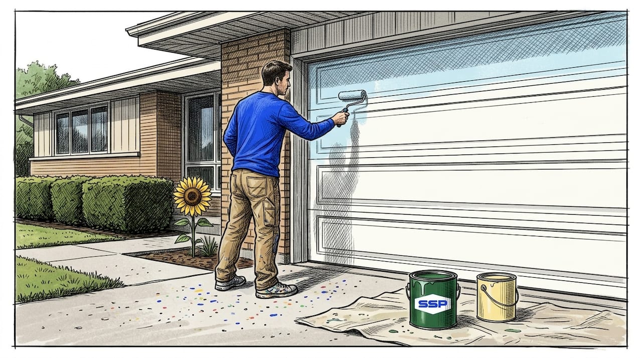
4. Practical tips for testing and evaluating your color choices
This is where most homeowners make their biggest mistake. They pick a color from a small chip under fluorescent store lighting, apply it once, and commit. That is not how professional painters approach color selection, and it is not how you should either.
Follow these steps before you finalize any exterior color scheme:
- Buy sample quarts and apply them directly to the exterior. Do not test on paper or cardboard. The texture and porosity of your siding affects how a color reads.
- Observe the samples at three different times of day. Morning light is cool and blue. Midday light is harsh and flattening. Evening light is warm and golden. Sampling at multiple light exposures catches undertone shifts you will never see in a store.
- Test your trim and base color at the same time. Evaluating colors in isolation is a common trap. Checking base and trim together reveals whether architectural details will stand out or disappear.
- Check the samples in shade and direct sun. North-facing walls receive reflected light that reads cooler. South-facing surfaces get direct sun that washes colors out or intensifies them.
- Live with the samples for at least two full days before making a decision. Colors shift with cloud cover, seasonal light angles, and surrounding foliage.
On durability: high UV resistance is not optional in sun-heavy climates. Deep, saturated colors like navy, forest green, and black absorb more heat, which accelerates fading and surface degradation. If you live in a region with strong sun exposure, ask specifically about UV-protective formulations. Learning how weather shapes your paint job in your specific region is worth doing before you invest in premium materials.
5. Comparing exterior color combinations using the 60-30-10 rule
Understanding proportion is what separates a polished exterior from one that feels accidental. The 60-30-10 framework gives you a structure for combining colors so that nothing competes for attention.
Here is how common exterior color scheme ideas perform across different combinations:
| Base color (60%) | Trim color (30%) | Accent color (10%) | Best for |
|---|---|---|---|
| Soft gray | Bright white | Navy blue door | Contemporary, transitional homes |
| Warm white | Warm cream | Black shutters and hardware | Traditional, colonial-style homes |
| Sage green | Off-white | Terracotta or rust door | Craftsman, cottage, bungalow styles |
| Charcoal or deep navy | Light gray | Brass or copper fixtures | Modern farmhouse, updated contemporary |
| Warm taupe | White | Sunny yellow front door | Ranch, mid-century, coastal homes |
Low-contrast schemes, like a warm white body with cream trim, read as refined and quiet. They suit neighborhoods with HOA restrictions or more formal architectural styles. High-contrast schemes, like charcoal with bright white trim and a bold-colored door, create strong visual definition. They work particularly well on homes with interesting architectural details you want to highlight.
A few rules for applying this framework well:
- Keep your accent color to one or two elements. More than two accent applications starts to fragment attention.
- If your home has HOA painting requirements, build your palette within those parameters before exploring bolder options.
- Use your roof color as a silent fourth element. A brown roof with warm undertones will fight a cool gray body unless there is a warm trim to mediate.
My honest take on choosing exterior colors
I have worked with enough homeowners to recognize a pattern. The ones who end up happiest are not the ones who spent the most time browsing color palettes online. They are the ones who stopped looking at screens and started looking at their house.
Exterior color does not exist in isolation. I have seen beautiful colors that looked stunning in photos completely clash with a home's masonry, roofline, or the way afternoon light hits the west elevation. That is not a paint failure. It is a context failure.
My honest advice: do not trust your instincts until you have done the sample testing properly. Not once, not twice. Test at morning light, afternoon light, and dusk. What reads as a sophisticated greige at noon looks like a dusty purple at 7 PM on some homes. I have seen it happen more times than I can count.
The other thing I push back on is the fear of personality. Homeowners routinely underestimate how much a single bold accent, a yellow door, a terracotta shutter, or a deep navy trim, can transform a flat, forgettable facade into something genuinely memorable. You do not need to repaint the whole house to have impact. You just need one well-placed, intentionally chosen accent color.
Trends matter less than fit. The best exterior color for your home is the one that works with what is already there, not the one that appeared in a magazine this spring.
— Ryan
Get expert color guidance from Southshorepaint
Choosing colors from a chip is one thing. Getting them right on your actual home takes experience, proper preparation, and quality materials. Southshorepaint works with homeowners to match color choices to their specific architecture, local climate, and personal style before a single brush hits the wall.

From sample testing to final coat, the team at Southshorepaint delivers exterior painting results that hold up beautifully over time. Whether you are working with a specific palette or starting from scratch, expert guidance makes the difference between a color you settle for and one you love for years. Explore the Southshorepaint blog for more guidance, or reach out directly to schedule a color consultation and exterior assessment today.
FAQ
What are the best exterior paint colors for curb appeal?
Soft neutrals like warm whites, taupes, and grays consistently top curb appeal rankings, with accents in navy, black, or bold yellow adding visual interest. These palettes suit the widest range of architectural styles and neighborhoods.
How do I choose exterior paint without making a costly mistake?
Test paint samples on the actual exterior surface and observe them at multiple times of day before committing. Always evaluate your base and trim colors together rather than in isolation.
What exterior paint colors are trending in 2026?
Atmospheric blues, soft greens, and sunny yellows are leading 2026 trends, alongside classic whites and deep blacks that continue to dominate by total volume. Nature-inspired biophilic hues are gaining particular momentum.
What is the 60-30-10 rule for exterior color?
The 60-30-10 rule assigns 60% of your exterior to the dominant body color, 30% to trim, and 10% to a single accent color like the front door or shutters. This proportion creates visual balance without any one element overwhelming the others.
Does exterior paint color affect home value?
Yes. Light-reflective neutrals can make a home appear larger and more inviting, which supports both perceived and appraised value. Maintaining a well-painted exterior protects the structure and signals care to prospective buyers.