Modern home painting ideas are defined by warm, nature-inspired palettes and intentional techniques that replace the cool gray dominance of the past decade. In 2026, interior color trends from Benjamin Moore, Sherwin-Williams, and leading designers have shifted decisively toward soft greiges, earthy terracottas, muted greens, and warm whites that make rooms feel grounded and personal. Alongside this palette shift, techniques like color-drenching and color-capping are giving homeowners tools to create spaces that feel considered rather than generic. Whether you are repainting a single room or planning a full interior refresh, understanding these trends helps you make choices that will hold up aesthetically for years.
1. Modern home painting ideas start with the right color palette
The foundation of any successful modern interior is the color palette, and 2026 has made the direction clear. Warm neutrals and nature-inspired hues like Benjamin Moore White Dove, Swiss Coffee, soft greiges, and earthy greens have replaced cool grays as the go-to choices for contemporary walls. Cool grays, which dominated interiors for nearly fifteen years, now read as flat and dated in most lighting conditions.
The shift matters because warm neutrals interact with natural light in a fundamentally different way. They absorb and reflect warmth rather than amplifying the blue cast that north-facing rooms already struggle with. Designers note that warm sage, terracotta, and muted greens convey comfort, individuality, and a calming aesthetic that resonates with how people actually want to feel in their homes.
Here are the core palette categories worth knowing for 2026:
- Warm whites: Benjamin Moore White Dove and Sherwin-Williams Alabaster offer brightness without the harshness of stark white.
- Soft greiges: A blend of gray and beige that reads as neutral without feeling cold. Works in nearly every room orientation.
- Earthy greens: Muted sage and olive tones that connect interiors to the natural world without overwhelming the space.
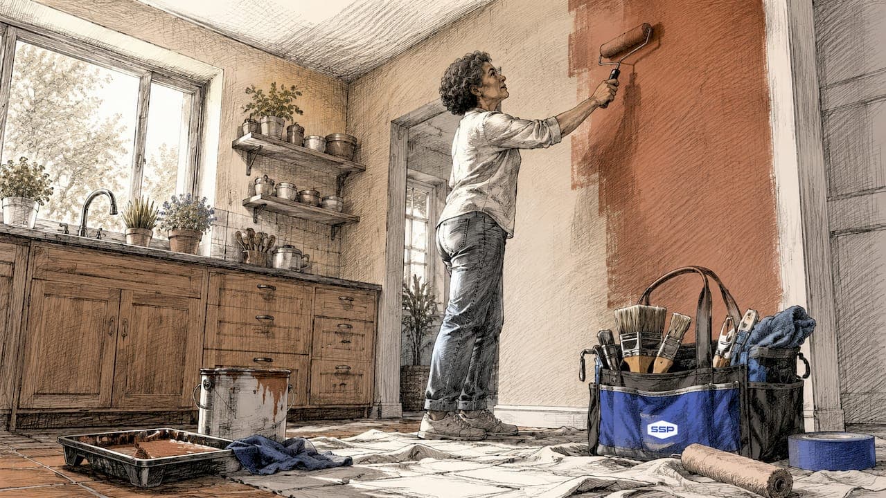
- Terracotta and clay: Rich, warm hues that work as full-room colors or as accent tones against softer neutrals.
- Deep neutrals: Charcoal and navy used as accent colors or in smaller rooms where drama is the goal.
Pro Tip: North-facing rooms flatten warm tones and exaggerate cool ones. Paint one half-step warmer than the chip suggests to maintain the intended warmth under natural light.
2. Color-drenching vs. color-capping: which technique fits your space
Two techniques define the modern interior painting conversation in 2026, and they serve very different design goals. Understanding both helps you choose the right approach before you open a single can.
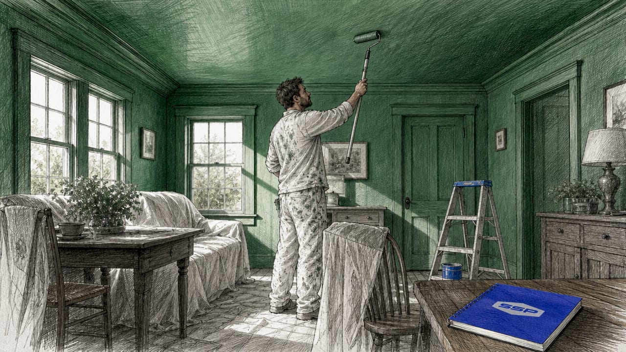
Color-drenching involves painting all surfaces in a room, including walls, ceiling, trim, and even doors, in one continuous shade. The effect is immersive and enveloping. Rooms feel larger, more intentional, and architecturally cohesive. Color-drenching creates an immersive single-shade effect that works especially well in smaller rooms where you want to eliminate visual interruptions.
Color-capping is the newer technique gaining traction as an elegant alternative. It uses three to four tones from the same color family, arranged in horizontal bands. Color-capping places the palest shade near the bottom, mid-tones on the main wall surface, and the deepest tone on the ceiling. This creates a layered, tonal effect that feels sophisticated without requiring bold color commitment.
| Feature | Color-drenching | Color-capping |
|---|---|---|
| Number of shades | One | Three to four |
| Visual effect | Immersive, enveloping | Layered, tonal |
| Best room size | Small to medium | Any size |
| Ceiling treatment | Same color as walls | Darkest shade |
| Skill level | Moderate | Moderate to advanced |
| Mood created | Cocoon-like, dramatic | Balanced, whimsical |
Color-capping is gaining popularity as a considered design choice that offers tasteful color layering without overwhelming the space. It is particularly effective in living rooms and dining rooms where you want visual interest without committing to a single bold hue across every surface.
Pro Tip: When color-drenching, vary the sheen by surface. Sheen differences between matte walls and glossier trim add depth and mask surface imperfections, producing a noticeably higher-end result.
3. How to choose the right paint finish for modern interiors
Paint finish is one of the most overlooked decisions in any painting project, and it directly affects how long your walls look good. The finish you choose determines durability, cleanability, and how light interacts with the surface.
Eggshell and satin finishes strike the best balance between durability and aesthetic appeal for modern living spaces. Eggshell offers a low sheen that is wipeable without the reflective quality of gloss, making it ideal for living rooms, bedrooms, and hallways. Satin has slightly more sheen and holds up well in kitchens and bathrooms where moisture and cleaning are regular factors.
Flat and matte finishes are visually appealing, especially for color-drenched rooms where you want to minimize light reflection. The practical limitation is that flat finishes show marks more readily and are harder to clean without damaging the surface. Reserve matte finishes for low-traffic areas like formal dining rooms or primary bedrooms where walls are rarely touched.
Here is a practical finish selection guide by room:
- Living room: Eggshell for main walls, satin for trim and doors.
- Kitchen: Satin throughout for easy cleaning and moisture resistance.
- Bathroom: Satin or semi-gloss to handle humidity without peeling.
- Bedroom: Eggshell or matte for a calm, low-reflective finish.
- Hallways and stairs: Satin for durability in high-contact zones.
- Ceilings: Flat white or flat in the wall color for color-drenching projects.
For interior finish selection, the rule is simple: the more traffic a surface sees, the higher the sheen should be. Choosing the wrong finish is one of the most common reasons a paint job looks worn within a year.
4. How to test paint colors before committing
Testing paint colors is not optional if you want to avoid expensive repaints. The way a color looks on a small chip under store lighting is almost never how it looks on your wall at home.
Paint large swatches of at least two by two feet, applying two full coats to get an accurate read on the true color. Small test patches dry lighter and give a misleading impression of the final result. Apply your test swatches directly on the wall rather than on paper or cardboard, since the backing material changes how the color reads.
Observe each swatch at morning, midday, and evening under both natural and artificial light. Undertones shift dramatically depending on the time of day and the direction your windows face. A greige that looks perfectly balanced at noon can pull distinctly pink or green by late afternoon. Test swatches near windows and in shadowed corners to understand the full range of how the color will behave.
Photograph each swatch at different times of day and label your photos with the color name and finish. This gives you a reliable comparison tool and prevents the common mistake of relying on memory when choosing between two similar shades.
5. Room-by-room modern painting ideas for 2026
Applying modern interior color palettes effectively means thinking about each room's function, light, and the mood you want to create. Generic advice about "neutral walls" misses the specificity that makes a space feel intentional.
- Living room: Soft warm neutrals like greige or warm white on main walls, with a bold accent on the trim or a single architectural feature. Unique living room paint ideas in 2026 lean toward color-capping schemes that add dimension without requiring a traditional accent wall.
- Kitchen: Nature-inspired greens and cozy neutrals are replacing the all-white kitchen aesthetic. Muted sage on lower cabinets paired with a warm white on upper cabinets and walls creates a grounded, modern look.
- Bathroom: Bold earth tones and deep blues are replacing the pale gray tiles-and-white-walls formula. A deep terracotta or navy on all four walls in a small bathroom reads as intentional and spa-like rather than overwhelming.
- Bedroom: Saturated, calming hues in the dusty rose, warm taupe, or deep sage range create the boutique hotel effect that designers reference frequently for 2026. These colors work best with eggshell or matte finishes that absorb light rather than reflect it.
- Home office: Warm charcoal or deep olive on the wall behind a desk creates a focused, professional backdrop without the coldness of traditional gray. Dark charcoal walls show scuffs more readily, so plan for a satin finish and periodic touch-ups in working spaces.
The common thread across all these rooms is intentionality. Modern painting in 2026 is not about picking a safe neutral and hoping for the best. It is about choosing colors that serve the specific function and feel of each space.
6. Eco-friendly and premium paint: what to look for
Eco-friendly home painting has moved from a niche preference to a mainstream consideration, and the product quality has improved to match. Low-VOC and zero-VOC paints from brands like Benjamin Moore Natura, Sherwin-Williams Harmony, and Clare Paint now perform comparably to conventional formulas in coverage, durability, and color depth.
VOC stands for volatile organic compounds, the chemicals responsible for the sharp paint smell and indoor air quality concerns. Zero-VOC formulas are particularly relevant for bedrooms, nurseries, and homes with limited ventilation. The practical benefit beyond air quality is that low-VOC paints dry faster and allow rooms to be reoccupied sooner after painting.
Premium paint also delivers measurable value in coverage and longevity. Avoiding cheap paints means fewer coats to achieve full coverage, better color retention over time, and a finish that holds up to cleaning without dulling. For modern interiors where the color and finish are doing significant visual work, the quality of the paint itself is not a place to cut costs.
Key takeaways
Modern home painting in 2026 is defined by warm, nature-inspired palettes combined with intentional techniques like color-drenching and color-capping that create depth and personality in every room.
| Point | Details |
|---|---|
| Warm palettes dominate 2026 | Soft greiges, earthy greens, and warm whites have replaced cool grays as the modern standard. |
| Technique shapes the room | Color-drenching creates immersion; color-capping builds tonal layers for a balanced, sophisticated look. |
| Finish determines durability | Eggshell and satin finishes offer the best combination of modern aesthetics and practical cleanability. |
| Test before committing | Paint two-by-two-foot swatches with two coats and observe under multiple lighting conditions throughout the day. |
| Premium paint pays off | Higher-quality formulas cover better, last longer, and maintain color integrity under regular cleaning. |
What I have learned watching color trends shift
The move away from cool gray is not a trend. It is a correction. For years, cool gray was treated as the safe, universally flattering neutral, and the result was interiors that felt clinical and interchangeable. What I see now, working with homeowners across a range of spaces, is a genuine hunger for color that feels personal and warm without being loud.
The most successful modern interiors I have encountered are not the ones that follow every 2026 trend list to the letter. They are the ones where the homeowner made deliberate choices about how they want to feel in a room and then selected colors and techniques that serve that feeling. Color-capping in a dining room works not because it is fashionable but because it creates a sense of enclosure and warmth that makes people want to linger at the table.
My honest observation is that most homeowners underestimate the impact of finish selection and overestimate the importance of the specific color. A beautiful warm sage in flat finish on a high-traffic hallway wall will look tired within eighteen months. The same color in satin will still look sharp at year three. The technique and the material quality matter as much as the color choice itself. That is the part of the conversation that gets skipped in most trend articles, and it is the part that determines whether your paint job holds up or needs redoing in two years.
— Ryan
Ready to bring your modern painting vision to life?
Choosing the right colors and techniques is only half the work. The other half is execution, and that is where preparation, premium materials, and skilled application make the difference between a paint job that looks good for a season and one that holds up for years.

Southshorepaint specializes in high-quality interior and exterior finishes built on proper prep and premium materials. Whether you are planning a full interior refresh with color-capping or a single room transformation with a bold earthy tone, the Southshorepaint team brings the workmanship to match your vision. Explore the interior painting services at Southshorepaint or read more about painting interior walls for lasting results before your next project.
FAQ
What are the most popular modern home paint colors for 2026?
Warm whites like Benjamin Moore White Dove, soft greiges, muted greens, and terracotta are the leading choices for 2026 interiors. These shades have replaced cool grays as the standard for contemporary, nature-inspired spaces.
What is color-capping and how does it differ from color-drenching?
Color-capping uses three to four tones from the same color family in horizontal bands, with the palest near the floor and the darkest on the ceiling. Color-drenching applies a single shade to all surfaces for a fully immersive, enveloping effect.
What paint finish works best for modern living rooms?
Eggshell is the recommended finish for modern living rooms because it is wipeable, low-sheen, and durable enough for regular use without the reflective quality of satin or gloss.
How do I test paint colors before painting a full room?
Apply two coats over a two-by-two-foot area directly on the wall and observe the swatch at morning, midday, and evening under both natural and artificial light to see how undertones shift throughout the day.
Is eco-friendly paint a good option for modern interiors?
Zero-VOC and low-VOC paints from brands like Benjamin Moore Natura and Sherwin-Williams Harmony now match conventional paint in coverage and durability, making them a practical choice for bedrooms and spaces with limited ventilation.