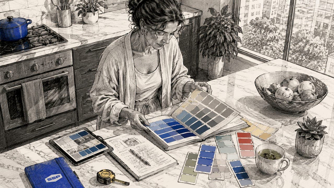
Color consultation painting is the process of selecting and applying paint colors using expert design principles to improve your home's aesthetic appeal with confidence and precision. The practice draws on proven frameworks like the 60-30-10 rule, undertone analysis, and color harmony theory to eliminate guesswork from one of the most consequential decisions in home improvement. Whether you're refreshing a single room or repainting your entire exterior, understanding how professional color choice consultation works will save you time, money, and the frustration of a color that looks nothing like the swatch. This guide walks you through every stage of the process, from foundational principles to final verification.
What are the essential principles for color consultation painting?
Color consultation painting rests on three foundational concepts: undertones, color harmony, and the 60-30-10 rule. Mastering these three before you pick up a brush separates a cohesive result from a costly repaint.
Understanding undertones
Every paint color carries undertones that shift how it reads once applied to a wall. A white that looks crisp in the store may pull blue or yellow in your living room depending on your light source. This is the single most common reason DIY paint colors look wrong once they're on the walls. Artificial lighting amplifies warm undertones; north-facing rooms with cool natural light expose cool undertones in ways that surprise most homeowners.
The 60-30-10 rule explained
The 60-30-10 rule divides a room's color into three proportions: 60% dominant color on walls, 30% secondary color on large furniture or upholstery, and 10% accent color in decor and accessories. This ratio produces a cohesive, professional result without sensory overload. Think of a navy sofa (30%) against warm gray walls (60%) with brass fixtures and throw pillows as the accent (10%). The math is simple, but the discipline it requires is what most homeowners skip.
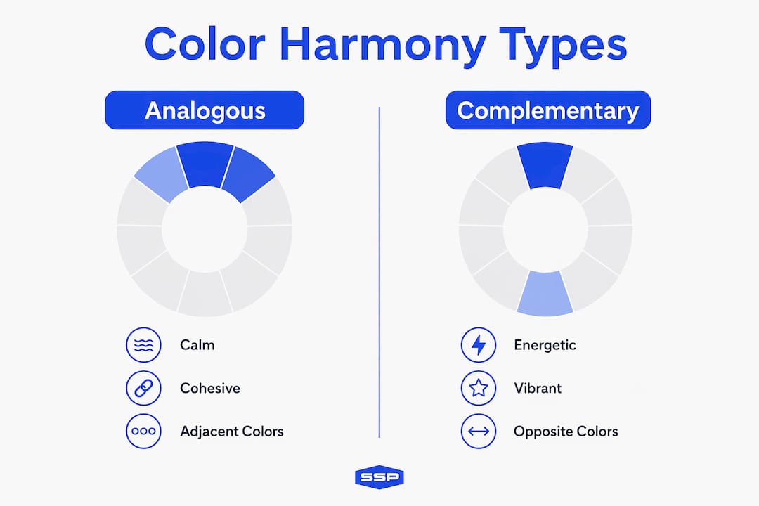
Color harmony types and their effects
Analogous color schemes use colors that sit adjacent on the color wheel, producing calm and cohesive rooms. Complementary schemes pair colors from opposite sides of the wheel, creating contrast and energy. A bedroom benefits from an analogous palette in soft blues and greens. A kitchen or home office where alertness matters responds well to a complementary scheme. Choosing the wrong harmony type for a room's function is a subtle but real mistake.
Tools to support your palette decisions
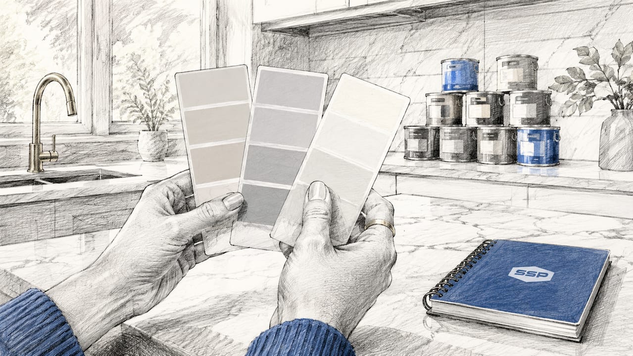
Digital color harmony tools like MightyPaint allow you to visualize complementary, analogous, and triadic schemes before a single drop of paint touches your wall. These tools provide HEX codes and suggested area percentages, which removes the guesswork from translating a palette idea into actual proportions. Pair digital tools with physical paint chips from Benjamin Moore or Sherwin-Williams to cross-reference what you see on screen with real-world pigment behavior.
Pro Tip: Never evaluate paint chips under fluorescent store lighting. Bring physical swatches home and hold them against your walls at different times of day before committing.
- Undertones: check for warm (yellow, red) or cool (blue, green) bias in every color
- Color harmony type: decide between analogous (calm) or complementary (energetic) before building your palette
- 60-30-10 ratio: assign each color a role before purchasing
- Digital tools: use MightyPaint or similar platforms to preview schemes
- Physical swatches: always test Benjamin Moore or Sherwin-Williams chips in your actual space
How to prepare your space for a room color consultation
Preparation determines whether your final color choice works in practice or only in theory. Skipping this stage is the most expensive mistake you can make.
Start by cataloging your fixed elements. Flooring, countertops, cabinetry, and permanent fixtures cannot be changed easily, so their undertones must anchor your color decisions. A warm-toned hardwood floor will clash with a cool gray wall if you ignore the undertone relationship between them. Pull a sample of your flooring material and hold it against candidate paint swatches before you commit.
Next, consider room function when selecting paint finish. Paint finishes directly affect both color perception and durability. Matte finishes work best in bedrooms where light absorption creates a restful atmosphere. Eggshell suits living spaces because it resists scuffs while maintaining a soft appearance. Semi-gloss belongs in kitchens, bathrooms, and any high-moisture area where cleanability matters.
Preparation checklist
- Photograph the room in morning, midday, and evening light
- List all fixed elements and note their dominant undertones
- Remove or cover large furniture to assess wall color in isolation
- Purchase 2-inch by 2-inch paint chip samples from at least three candidate colors
- Gather a white foam board or poster board for swatch mounting
- Note the room's primary light source: north, south, east, or west facing
| Preparation step | Why it matters |
|---|---|
| Photograph in multiple lighting conditions | Color reads differently at 8 a.m. versus 6 p.m. |
| Catalog fixed element undertones | Prevents undertone clashes with walls and trim |
| Select finish by room function | Finish affects durability and final color appearance |
| Mount swatches on white board | Eliminates background color interference during evaluation |
| Note light source direction | North-facing rooms need warmer colors to avoid feeling cold |
Pro Tip: Paint a 12x12 inch test patch directly on the wall rather than relying on small chips. A larger patch reveals how the color behaves at scale, especially near trim and in corners.
Step-by-step process for a color consultation painting session
A structured session produces better results than browsing paint chips by instinct. Follow this sequence to build a palette that works across every surface in the room.
-
Identify the room's focal point. Every room needs one dominant visual anchor. A fireplace, a large window, or a feature wall serves this role. Mixing bold furnishings with neutral walls creates balance and lets the eye rest. If your sofa is a statement piece, your walls should recede, not compete.
-
Assign the 60% dominant color. Choose a wall color that complements your fixed elements and supports the room's mood. Warm neutrals like Benjamin Moore's Pale Oak or Sherwin-Williams' Accessible Beige work broadly because their undertones align with most wood tones and natural light.
-
Select the 30% secondary color. This lands on large upholstered furniture, area rugs, or drapery. The secondary color should share at least one undertone with the dominant wall color to maintain cohesion.
-
Choose the 10% accent color. Accent colors appear in throw pillows, artwork frames, light fixtures, and small decor objects. This is where you introduce contrast or energy without overwhelming the space.
-
Refine using color harmony principles. Cross-check your three chosen colors against an analogous or complementary scheme. If the room needs calm, confirm all three colors sit within a 90-degree arc on the color wheel. If it needs energy, verify that your accent sits opposite your dominant color.
-
Address the ceiling. The ceiling is often called the fifth wall because it completes the room's visual envelope. Painting it a shade lighter than your wall color adds height. In smaller rooms and bathrooms, a colored ceiling can enhance architectural details and create intimacy. White ceilings work universally but represent a missed design opportunity in rooms with strong architectural character.
Coordinating interiors with exteriors
When your interior palette is set, carry at least one undertone through to your exterior color choices. A home with warm-toned interior walls and cool gray exterior siding will feel disconnected. Check out exterior paint color ideas to see how professionals align indoor and outdoor palettes for a unified result.
| Interior approach | Exterior coordination |
|---|---|
| Warm neutral walls (beige, cream) | Warm exterior body color (tan, taupe, warm white) |
| Cool gray walls | Cool exterior body color (slate, cool white, blue-gray) |
| Bold accent wall interior | Repeat accent color on shutters or front door |
| Analogous interior scheme | Pull one color from the scheme for exterior trim |
Common mistakes to avoid in home color selection
Most color failures trace back to a small set of repeatable errors. Knowing them in advance is the most efficient form of preparation.
- Ignoring undertones. A "greige" that looks perfect in the store turns pink or purple on your walls because of undertone interaction with your light source. Always test on the actual wall.
- Matching everything too closely. Rooms where all colors share the same hue, value, and chroma look flat and lifeless. Variety in these three dimensions creates visual interest.
- Overusing saturated colors. One deeply saturated color in a room reads as bold and intentional. Three saturated colors at equal intensity read as chaotic. Contrast between saturation levels provides visual rest.
- Choosing the wrong accent wall. An accent wall should highlight an architectural feature, not just the wall you happen to see first. Fireplaces, built-in shelving, and window walls are natural candidates.
- Skipping the finish decision. Choosing the right color in the wrong finish undermines the result. A flat paint in a kitchen will show every grease mark within weeks.
"The most common mistake I see is homeowners falling in love with a color on a chip and never testing it on the wall. The chip is a starting point, not a decision." — Southshorepaint
Mixing warm and cool colors creates balanced, pleasing rooms. Pure color matches, where everything is the same temperature, often clash or appear dull. The fix is intentional contrast: a warm wall with a cool accent, or a cool dominant color with warm wood tones in the furniture.
How to verify and finalize your painting color choices
Verification is the stage most homeowners skip because it feels slow. Skipping it is how you end up repainting a room twice.
-
Apply a 12x12 inch test patch on the actual wall. Testing paint colors at this scale on real walls under varying lighting conditions is the standard recommended by color professionals. A small chip cannot replicate how a color behaves across a full wall surface.
-
Observe the patch at three times of day. Check it in morning natural light, midday light, and under your evening artificial lighting. A color that passes all three conditions is a reliable choice.
-
Evaluate against your fixed elements. Hold your flooring sample, a fabric swatch from your sofa, and a trim paint chip next to the test patch simultaneously. This is the only way to confirm undertone compatibility across all surfaces.
-
Consult a professional if you're uncertain. Virtual color consultations are now widely available from professional painting companies. Southshorepaint offers expert color advice as part of its residential painting services, which removes the risk of a costly mistake before work begins. For a broader view of current color trends, the best paint colors for homes in 2026 provides a useful reference point.
-
For renters, consider reversible options. Peel-and-stick paint samples and removable wallpaper panels let you test color impact without permanent commitment. If your lease permits painting, stick to neutral palettes that are easy to return to white at move-out.
Key takeaways
Successful color consultation painting requires undertone analysis, the 60-30-10 rule, and verified test patches before full application.
| Point | Details |
|---|---|
| Undertones determine success | Test every color on the actual wall to catch undertone shifts before committing. |
| 60-30-10 rule structures palettes | Assign 60% to walls, 30% to large furniture, and 10% to accents for a cohesive result. |
| Harmony type sets the mood | Use analogous schemes for calm rooms and complementary schemes for energetic spaces. |
| Finish selection affects durability | Match finish to room function: matte for bedrooms, semi-gloss for kitchens and baths. |
| Verification prevents repainting | Apply a 12x12 inch test patch and observe it across morning, midday, and evening light. |
Why I think most homeowners underestimate color consultation
After years of working on residential and commercial painting projects, I've seen the same pattern repeat. A homeowner spends weeks choosing furniture and days choosing a paint color. The furniture decision gets a showroom visit, fabric samples, and careful deliberation. The paint decision gets a chip from the hardware store and a gut feeling.
Color is the largest surface in any room. It affects how large the space feels, how warm or cool the atmosphere reads, and how every other element in the room looks against it. Getting it wrong is not a minor inconvenience. It means living with a space that feels slightly off, or paying to repaint it.
The 60-30-10 rule and undertone analysis are not complicated concepts. They take about an hour to understand and apply. What they replace is weeks of second-guessing and the real cost of a color that doesn't work. Professional color advice is not a luxury for people who can't decide. It's a structured process that produces a predictable result. That's what Southshorepaint brings to every project, and it's why the color conversation happens before the first can is opened, not after.
— Ryan
Let Southshorepaint handle the color decisions for you
Choosing the right colors for your home should feel satisfying, not stressful. Southshorepaint provides professional color consultation as part of every residential painting project, so you get expert interior color advice before a single wall is touched.

Our team works through undertone analysis, finish selection, and palette development with you directly, whether you're updating one room or repainting your entire home. We use premium materials and proper preparation on every job because a great color choice deserves a great application. Visit Southshorepaint's painting services to schedule a consultation and get your project started with confidence. You can also explore our painting ideas for 2026 for inspiration before we talk.
FAQ
What is color consultation painting?
Color consultation painting is the process of selecting paint colors using expert design principles, including undertone analysis, the 60-30-10 rule, and color harmony theory, to achieve a cohesive and visually appealing result.
How does the 60-30-10 rule work in interior painting?
The 60-30-10 rule assigns 60% of a room's color to walls, 30% to large furniture or upholstery, and 10% to accent decor. This ratio creates a balanced palette that avoids visual overload.
Why do paint colors look different on walls than on chips?
Paint undertones shift depending on your room's light source, wall texture, and surrounding colors. A chip under store lighting cannot replicate how a color behaves on a full wall in your home.
What paint finish should I use for each room?
Matte finishes suit bedrooms, eggshell works in living spaces, and semi-gloss belongs in kitchens and bathrooms where moisture and cleanability are priorities.
Can renters benefit from a color consultation?
Yes. Renters can use peel-and-stick paint samples and removable panels to test color impact without permanent changes. Where painting is permitted, a professional color consultation helps select neutral palettes that are easy to restore at move-out.